Time Tracking Reporting Dashboard: Utilisation, Burn, and Capacity You Can Trust
Your firm logs hours, but partners still fly blind on utilisation rates, project burn, and team capacity. Raw timesheets without a reporting dashboard leave hiring, staffing, and profitability as month-end surprises.
We build the time analytics layer that makes those hours actionable.
Sound Familiar?
These are the exact issues managing partners and ops directors faced before a trusted reporting dashboard:
- Partners only see utilisation at month-end, when it is already too late to rebalance the week
- Project burn stays invisible until the write-down lands on the invoice
- Ops rebuilds capacity and utilisation reports by hand from Harvest, Toggl, or Clockify exports
- Hybrid teams make "who is free" a guess, so hiring and staffing decisions rely on gut feel
- Finance and delivery argue over the same numbers because nobody trusts a single dashboard
Hybrid work and tool sprawl make utilisation opaque. Hours sit in Harvest, Toggl, or Clockify while capacity lives in a spreadsheet. Industry billable utilisation fell to 66.4% in 2025, the lowest SPI Research has recorded, while partners still discover burn only when the write-down arrives.
What the Time Analytics Dashboard Actually Does
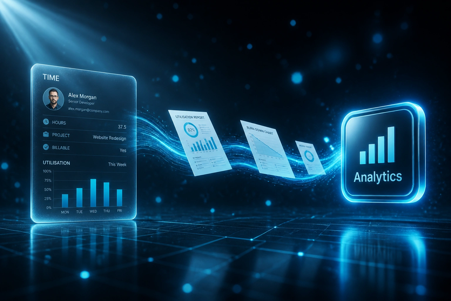
Hours land → utilisation and burn update → capacity trends surface → partners act before the quarter closes.
Hours Sync In
Approved time entries flow from Harvest, Toggl, Clockify, or your tracker into one reporting layer
Utilisation Calculated
Billable hours vs available capacity by person, team, and role, with the formulas your partners already trust
Burn & Capacity Surface
Project burn vs budget and team capacity trends update mid-week, not only at month-end
Partners Decide
Hiring, staffing, and write-down risk become weekly conversations backed by the same trusted view
Everything You Need for Trusted Utilisation Reporting
Utilisation Rate Dashboards
Billable vs available hours by person, team, and role, refreshed from your time tools so partners see utilisation rates without waiting for month-end.
Project Burn Visibility
Budgeted hours vs actual burn on every engagement, with alerts before a project tips into overrun rather than after the write-down.
Team Capacity Trends
Forward-looking capacity views that show who is overallocated, who has spare hours, and when the bench will tighten over the next 4–8 weeks.
Time Analytics Layer
One reporting layer over Harvest, Toggl Track, Clockify, and project tools so time analytics live in a single trusted view instead of five spreadsheets.
Partner & Ops Packs
Scheduled packs for managing partners and ops directors: utilisation, burn, capacity, and trend lines ready for Monday leadership meetings.
Exception Alerts
Threshold alerts when utilisation drops, a project hits 80% of budgeted hours, or a role runs short so you act mid-week, not mid-quarter.
Sources and Destinations We've Connected
From 7 Hours/Week of Spreadsheets to a Live Utilisation View
How a 22-person Cape Town advisory firm stopped flying blind on utilisation, burn, and capacity.
The Manual Reporting Ritual
- Ops exported Harvest and Monday hours into Excel every Friday
- Partners only saw utilisation at month-end, often after staffing mistakes
- Three projects blew budget by 20%+ before anyone noticed the burn
- Capacity for the next month was a whiteboard guess across hybrid teams
- Finance and delivery argued over whose spreadsheet was "right"
The Reporting Dashboard
- Approved hours sync into one utilisation and burn dashboard overnight
- Partners open the same view every Monday: rates, burn, and capacity trends
- Alerts fire when a project hits 80% of budgeted hours
- Bench and overload show four weeks ahead, so hiring is planned, not panicked
- One trusted number set ends the spreadsheet debate
Before vs After a Time Tracking Reporting Dashboard
How It Works
From first conversation to a live reporting dashboard in 2–4 weeks.
Tell Us Your Setup
Which time tools you use, how partners see utilisation today, and where burn and capacity stay blind.
Free Scoping Call
30-minute call to map the metrics that matter, the sources of truth, and the dashboard layout ops will actually open.
Build & Test
We connect your time and project data, build the reporting layer, and run parallel weeks so the numbers prove out against your spreadsheets.
Go Live & Monitor
Switch off the Friday export ritual. Monitoring keeps feeds healthy and alerts firing when utilisation or burn drifts.
Frequently Asked Questions
How is a reporting dashboard different from the time tracking tools we already use?
Harvest, Toggl Track, and Clockify are strong at capture. Most firms still lack a trusted utilisation, burn, and capacity view across people and projects. We build the time analytics layer that turns those hours into the resource decisions partners and ops directors need.
How long does a time tracking reporting dashboard take to set up?
A focused utilisation and burn dashboard typically takes 2–4 weeks from scoping to go-live. Firms that also need capacity forecasting, multi-tool consolidation, and scheduled partner packs usually land in 4–6 weeks.
Which time tools and BI platforms can you connect?
We regularly pull from Harvest, Toggl Track, Clockify, Float, and Monday.com into Power BI, Looker Studio, Metabase, or a custom warehouse. If your stack exposes time entries, projects, and rates, we can feed a single reporting layer.
Will this replace our timesheet process?
No. Capture and approvals stay where they work. The dashboard sits on top so partners see utilisation rates, project burn, and capacity trends without asking ops to rebuild spreadsheets every Friday.
How do you keep the numbers trustworthy?
We define utilisation and burn formulas with your ops lead, map billable flags and available capacity correctly, and reconcile the first weeks against your existing reports. Failed syncs retry automatically, and exception alerts surface gaps early.
How much does a time analytics dashboard cost?
Focused utilisation and burn dashboards start from around R15,000. Multi-source reporting with capacity trends, partner packs, and alerts typically ranges from R25,000 to R60,000. Firms recovering even one percentage point of utilisation across a small team usually see payback within 2–3 months.
Stop Flying Blind on Utilisation and Burn
If partners still discover capacity and project burn at month-end, you are deciding on hiring and profitability with yesterday's picture.
Tell us which time tools you use, how utilisation is reported today, and where burn stays invisible. We will show you exactly how a time tracking reporting dashboard would work for your firm.